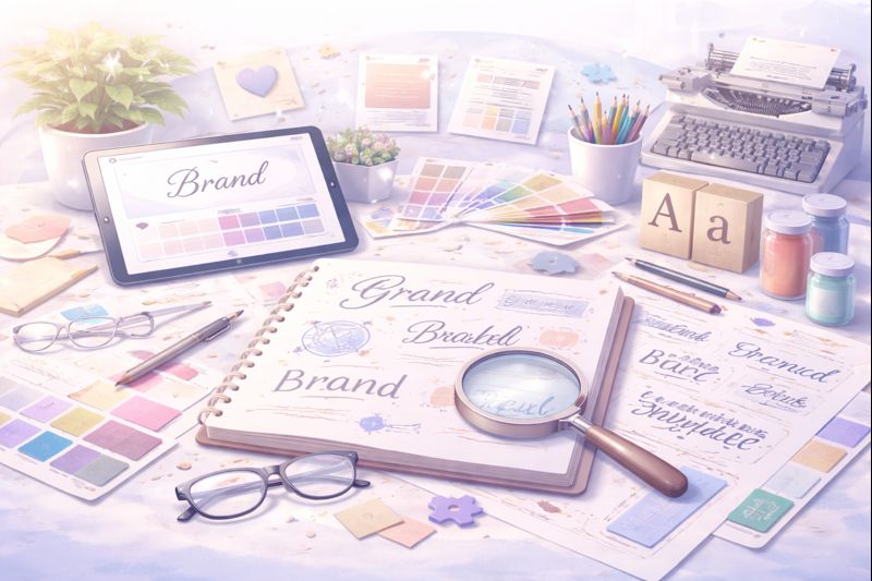
Introduction
Typography is more than just choosing a “nice font.”
The typeface you use in your logo plays a crucial role in how your brand is perceived — from professional and trustworthy to creative and playful.
Just like color, typography communicates personality, emotion, and values. In this guide, we’ll explore how to choose the right typography for your logo and how it shapes your brand identity.
Why Typography Matters in Logo Design
Typography influences how people feel about your brand before they read a single word.
The right typography helps your logo:
- Feel intentional and professional
- Communicate brand personality
- Improve readability and recognition
- Create consistency across platforms
A poorly chosen font can make even the best logo feel generic or untrustworthy.
Understanding Typography Psychology
Different font styles evoke different emotions and associations. Knowing this helps you choose strategically.
Serif Fonts – Trust, Tradition, Authority
Serif fonts have small decorative strokes at the ends of letters. They feel classic and reliable.
Best for:
- Luxury brands
- Editorial or publishing
- Professional services
Examples of personality: elegant, timeless, authoritative.
Sans Serif Fonts – Modern, Clean, Minimal
Sans serif fonts have clean lines and no decorative strokes. They are widely used in modern branding.
Best for:
- Tech companies
- Startups
- Digital-first brands
Examples of personality: modern, friendly, accessible.
Script Fonts – Creativity, Emotion, Personality
Script fonts mimic handwriting or calligraphy. They add warmth and individuality.
Best for:
- Beauty brands
- Food & beverage
- Personal brands
Use carefully — readability is key.
Display Fonts – Bold, Unique, Expressive
Display fonts are decorative and eye-catching. They are designed to stand out.
Best for:
- Creative industries
- Youth brands
- Artistic or niche businesses
They work best as accents, not long text.
How to Choose the Right Typography for Your Logo
1. Define Your Brand Personality
Ask yourself:
- Is my brand serious or playful?
- Classic or modern?
- Bold or subtle?
Your typography should visually express these traits.
2. Prioritize Readability
A logo must be legible at all sizes — from social media icons to packaging.
Avoid:
- Overly thin fonts
- Excessive decoration
- Poor spacing
If people can’t read it, they won’t remember it.
3. Consider Where Your Logo Will Appear
Your typography should work across:
- Websites
- Social media
- Print materials
- Packaging
Digital-first brands often benefit from clean, versatile fonts.
4. Combine Fonts Carefully
Many logos use:
- One main font
- One supporting font
Contrast is good — chaos is not. Keep the system simple and consistent.
5. Avoid Trends Without Strategy
Trendy fonts can age quickly. A strong logo typography should feel relevant today and still work years from now.
Common Typography Mistakes to Avoid
- Choosing fonts based only on personal taste
- Using too many typefaces
- Ignoring kerning and spacing
- Copying competitor styles
Typography should support your brand — not distract from it.
Final Thoughts
Typography is a powerful branding tool when chosen intentionally. The right font strengthens your logo, reinforces your brand personality, and creates visual consistency across all touchpoints.
At Dream Architects Studio, we design brand identities by combining strategy, typography, color psychology, and visual systems — not just aesthetics.
Not sure which typography fits your brand best?
We help entrepreneurs build strong brand identities — from logo design and typography to complete visual systems.
👉 Explore our Brand Architecture services
👉 Contact us to design your logo and typography system
One response to “How to Choose the Right Typography for Your Logo”
[…] Chapter 3 — How to Choose the Right Typography […]