Introduction
A strong logo is not just visually appealing — it’s functional, intentional, and built to last.
Many entrepreneurs invest time and money into logo design, yet end up with a mark that doesn’t represent their brand or work well in real-world applications.
In this article, we’ll break down what truly makes a strong logo and highlight the most common logo design mistakes to avoid when building your brand identity.
What Makes a Logo Strong?
A strong logo shares a few essential characteristics:
- Clear and recognizable
- Scalable and versatile
- Aligned with brand strategy
- Simple yet meaningful
- Timeless rather than trendy
When these elements work together, a logo becomes a powerful brand asset instead of just a graphic.
1. Simplicity Is Strength
Some of the world’s most iconic logos are also the simplest.
Simple logos:
- Are easier to recognize
- Scale better across platforms
- Stay memorable over time
Overly complex designs often lose clarity when resized or applied in different contexts.
2. A Strong Logo Is Built on Strategy
Design should never come before strategy.
A logo must reflect:
- Brand values
- Brand personality
- Target audience
- Industry positioning
Without strategy, a logo becomes decoration instead of communication.
3. Versatility Is Non-Negotiable
A strong logo works:
- In color and black & white
- On light and dark backgrounds
- In digital and print formats
- As an icon, symbol, or full lockup
If your logo only looks good in one format, it’s not ready.
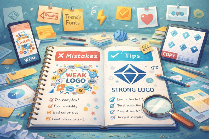
Common Logo Design Mistakes to Avoid
1. Designing Without Brand Foundations
Skipping brand strategy often leads to logos that look nice but feel disconnected.
Mistake:
- Designing based on personal taste only
Solution:
- Define brand values, personality, and audience first
2. Following Trends Too Closely
Trendy logos age quickly.
Mistake:
- Choosing styles just because they’re popular
Solution:
- Focus on timeless design principles
3. Using Too Many Colors or Fonts
Visual overload weakens recognition.
Mistake:
- Mixing too many elements
Solution:
- Build a clear visual hierarchy
4. Ignoring Scalability
Logos often fail when resized.
Mistake:
- Thin lines, excessive detail, or tiny text
Solution:
- Test your logo at very small sizes
5. Copying Competitors
Similarity creates confusion.
Mistake:
- Designing something that blends in
Solution:
- Use competitive analysis to differentiate, not imitate
6. Forgetting the Symbol
A strong logo often needs a symbol or icon that works independently.
Mistake:
- Relying only on text
Solution:
- Design a flexible logo system (symbol + wordmark)
Strong Logos Are Systems, Not Just Marks
Modern branding requires more than one logo version.
A strong logo system includes:
- Primary logo
- Secondary logo
- Symbol or icon
- Clear usage rules
This ensures consistency across every brand touchpoint.
Final Thoughts
A strong logo is intentional, strategic, and adaptable.
It doesn’t shout — it communicates clearly and confidently.
At Dream Architects Studio, we design logos as part of complete brand systems — combining strategy, psychology, and visual clarity to help brands grow with consistency and purpose.
Not sure if your logo is working for your brand?
We help entrepreneurs design strong, scalable logos that align with their brand identity and long-term vision.
👉 Explore our Brand Architecture services
👉 Contact us to review or redesign your logo