Creating the Brand Identity for Aurora Wellness
A complete wellness brand identity designed for digital platforms, mobile experiences, and modern self-care products — combining elegance, calmness, nature-inspired symbolism, and premium visual direction.
The Challenge
Aurora Wellness was envisioned as a modern wellness platform focused on mindfulness, emotional wellbeing, guided routines, and digital self-care experiences. The objective was to create a visual identity that felt peaceful, elevated, organic, and emotionally comforting across both web and mobile platforms.
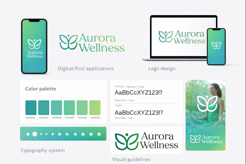
Dream Architects Studio developed the complete creative direction for the brand, including logo design, typography exploration, color palette development, digital identity concepts, and application mockups for future mobile and web experiences.
What We Created
The visual identity was carefully designed to communicate calmness, trust, emotional balance, and premium wellness positioning. The branding combines soft organic forms with modern typography to create a digital-first identity system adaptable to apps, wellness programs, and future digital products.
The Visual Direction
The visual language was built around softness, natural balance, and emotional clarity. The identity combines airy spacing, elegant serif typography, and organic forms inspired by wellness, nature, and mindfulness.
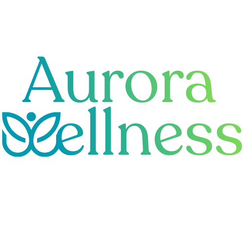
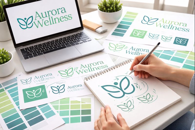
One of the most distinctive elements of the logo is the custom “W” symbol, designed to subtly resemble both a butterfly and a human figure with open arms. This dual symbolism reinforces ideas of transformation, peace, emotional growth, healing, and connection with nature.
The final result feels modern and premium while still remaining approachable, calming, and emotionally grounded.
Our Process
Brand Discovery
We explored the emotional positioning of the brand, focusing on peace, clarity, healing, mindfulness, and modern wellness aesthetics.
Symbol Exploration
Multiple logo directions were developed to combine elegance with organic symbolism inspired by nature and personal transformation.
Digital Applications
We explored how the visual identity could translate naturally into mobile apps, onboarding screens, and wellness experiences.
Final Identity System
The final deliverables included logo direction, visual language, color palette, typography, and scalable digital branding concepts.
Design Development
During the design process, we refined the balance between typography, spacing, and symbolic representation to ensure the logo remained versatile and recognizable across both digital and print applications.
The identity system was intentionally created to support future expansion into mobile wellness products, coaching platforms, guided routines, digital memberships, and modern self-care ecosystems.
The Result
A modern and emotionally engaging wellness identity system designed to feel elegant, peaceful, and digitally adaptable — ready to support mobile experiences, wellness platforms, digital products, and future brand expansion under a cohesive visual language.