Introduction
Choosing the right color for your logo is not just a design decision — it’s a psychological and strategic one. Colors influence how people perceive your brand, how they feel about it, and whether they remember it.
From trust and confidence to creativity and energy, color plays a powerful role in branding. In this guide, we’ll explore how to choose the right logo color using color psychology, so your brand communicates the right message from the very first glance.
Why Color Matters in Logo Design
Color is often the first thing people notice about a brand. Studies show that color can increase brand recognition by up to 80%, making it one of the most impactful branding tools.
The right color helps your brand:
- Create emotional connections
- Communicate personality and values
- Stand out from competitors
- Build trust and consistency
A poorly chosen color, on the other hand, can confuse your audience or send the wrong message.
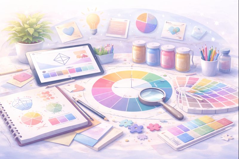
Understanding Color Psychology in Branding
Color psychology studies how different colors affect human emotions and behavior. While cultural context matters, certain color associations are widely recognized in branding.
Blue – Trust, Stability, Professionalism
Often used by tech, finance, and corporate brands. Blue communicates reliability, calmness, and confidence.
Best for:
- Corporate brands
- Technology companies
- Professional services
Red – Energy, Passion, Action
Red is bold and emotional. It creates urgency and excitement but should be used carefully.
Best for:
- Food & beverage brands
- Entertainment
- Brands focused on action or passion
Yellow – Optimism, Creativity, Warmth
Yellow feels cheerful and approachable. It attracts attention but works best as an accent color.
Best for:
- Creative brands
- Youth-focused businesses
- Friendly, approachable brands
Green – Growth, Nature, Balance
Green is strongly associated with health, sustainability, and harmony.
Best for:
- Wellness brands
- Eco-friendly businesses
- Food and organic products
Purple – Luxury, Creativity, Imagination
Purple combines the calm of blue and the energy of red, often associated with premium or artistic brands.
Best for:
- Beauty & fashion
- Creative industries
- Luxury brands
Black – Elegance, Power, Sophistication
Black is timeless and versatile. It signals authority, luxury, and simplicity.
Best for:
- Premium brands
- Fashion & lifestyle
- Minimalist identities
White – Simplicity, Clarity, Purity
White creates space and balance, often used to support other colors.
Best for:
- Modern brands
- Health & lifestyle
- Minimalist design systems
How to Choose the Right Color for Your Logo
1. Start With Your Brand Strategy
Before choosing a color, define:
- Your brand values
- Your brand personality
- Your target audience
- Your industry positioning
Color should reflect who you are, not just what looks good.
2. Know Your Audience
Different audiences respond to colors differently. Age, culture, and industry influence color perception. A playful pastel palette may work for a cupcake brand, but not for a law firm.
3. Analyze Your Competition
Look at your competitors’ color choices. This helps you:
- Avoid blending in
- Identify overused colors
- Find opportunities to stand out strategically
4. Think Beyond the Logo
Your logo color will live across:
- Website
- Social media
- Packaging
- Marketing materials
Choose colors that remain flexible and readable across all platforms.
5. Use a Color Palette, Not Just One Color
Strong brands don’t rely on a single color. They use a structured color system:
- Primary color
- Secondary colors
- Accent colors
This creates consistency and visual harmony.
Common Mistakes to Avoid
- Choosing colors based on personal preference only
- Following trends without strategy
- Using too many colors
- Ignoring contrast and accessibility
A beautiful logo that doesn’t communicate clearly is a missed opportunity.
Final Thoughts
Color is one of the most powerful tools in branding — when used intentionally. Choosing the right color for your logo helps your brand speak clearly, emotionally, and consistently.
At Dream Architects Studio, we design brands with purpose — combining strategy, psychology, and visual systems to build identities that last.
Not sure which colors represent your brand best?
We help entrepreneurs define their brand identity through strategic brand architecture, color psychology, and visual systems.
👉 Explore our Brand Architecture services
👉 Contact us to design your logo and color palette
One response to “How to Choose the Right Color for Your Logo: A Color Psychology Guide”
[…] Chapter 2 — How to Choose the Right Logo Colors […]